Borrowing from RPG Maker
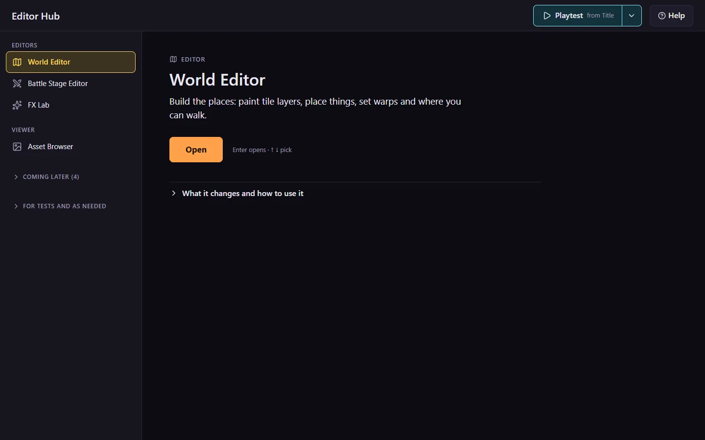
On October 5 I put visual editors into the rules, with the line “don’t make any decisions that would make that more difficult in the future”. The Editor Hub now lists three tools on main (the World Editor, the Battle Stage Editor and FX Lab). The Hack Editor, which Claude started last night, sits on its own branch with a fourth hub entry. Four more are marked Coming later: events, dialogue, troops and encounters, and sprites.
Three days before that rule I had told Claude to take “as much inspiration as you can from engines like rpg maker. Whenever functionality overlaps and it makes sense.” Claude read the official MZ help and wrote a tooling guide from it, marking anything it only inferred.
Straight from the help
The Database layout, a list of entries on the left and a form for the selected one on the right, is the shape of every editor here. The Troops tab, a placement view with a Battle Test button, became the Battle Stage Editor. You drag the heroes, the enemies, the horizon and the HUD boxes around the game’s own battle scene, then press Battle Test, which runs on the edits you haven’t saved yet.
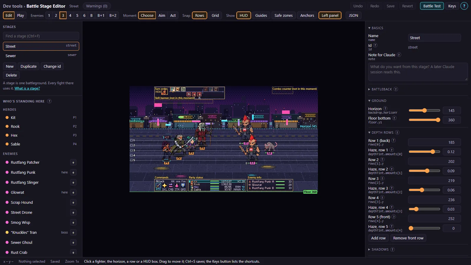
The guide also keeps a table of the places we differ on purpose, with a reason beside each. Entries have named ids like street, undo goes back 100 steps (RPG Maker’s is 20), and in the World Editor a right-click erases, which was on my list.
Painting maps
On the 22nd I moved the map editor ahead of the Sprite Editor: “I think the map editor tool will be the one to start with.” I wrote design notes (one line says “Autotiling? I’m not sure what this is, I haven’t learned yet”) and drew the layout by hand.
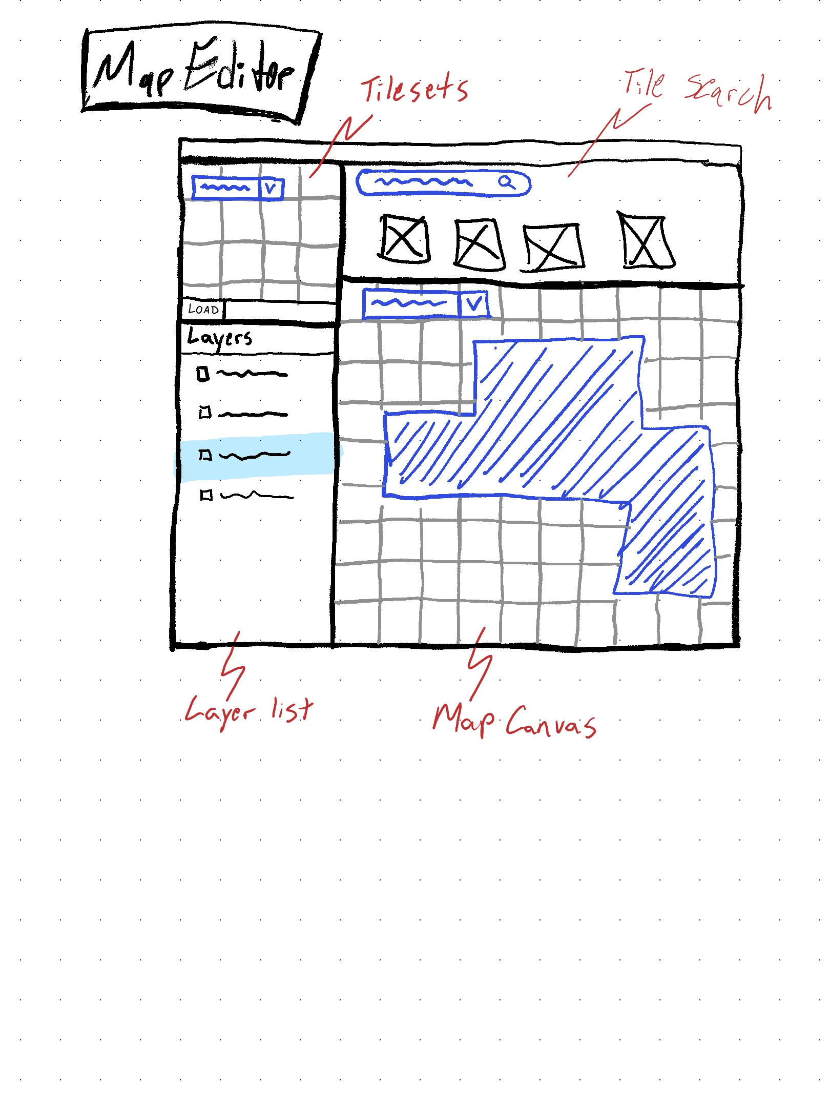
Claude wrote the build brief that night, and the first version merged the next day. The layout is the sketch. Collision and surfaces are paint modes over the walk flags, which come from RPG Maker’s passage marks and region ids. Autotiling is a swatch per terrain, and the map picks each cell’s shape from its neighbors.
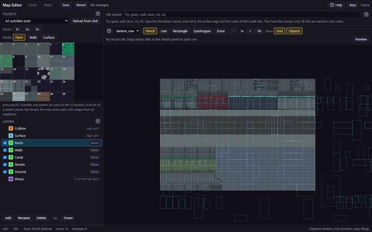
It was renamed the World Editor on the 25th. On the 24th I told Claude “The tool needs to catch invalid placements and other config”, so it has a Problems list. It warns about an NPC standing on a blocked cell, or one the player can’t reach from any warp, and it never blocks Save. I’m building and cleaning up the maps in it and in the Battle Stage Editor myself now, and I report what’s wrong as I go. On the 22nd I wrote “I’m really eager to begin creating these maps myself”, and now I am.
Hub notes
On the 25th I looked at Claude’s wireframe for the hub and said the current editors were “much too dense and rely way too much on words rather than icons”. I also said that the wireframe “was NOT a style reference, just a layout reference.” The Animation Editor is gone (“kill it completely. I have other ideas on this for later.”), and so is the Note for Claude field, a box in two editors for notes to a later Claude session (“I never really used that in the battle stage editor.”). The names Editor Hub and Playtest are RPG Maker’s words, my pick on issue #126. The hub merged on the 26th.
Tuning the hack scene
I tune the 3D hack scene by notes, and each note (a longer travel time, less glow) costs Claude a build and a verifier round. This tool lets me change the values myself and see them at once. Its first inspector showed all 92 values in one list, and today I said there were “way too many knobs to tweak all at once”. The new layout has a list of modes on the left, the live scene in the middle, and an inspector that shows only the values of the selected mode. Below the scene I asked for a timeline, “similar to a motion graphics or video editing tool”. Claude’s brief says it follows After Effects and iMovie, and that the camera slots follow Unity’s Cinemachine.
Claude built three rounds of it today: the mode list, a slider and color picker, and a scrubber for the Fly sequence.